


Visual Aesthetics: The festival branding should incorporate vibrant and diverse colors to represent the rich cultural tapestry of Black cuisine. It should evoke a sense of heritage, inclusivity, and modernity.
The Family Reunion
Rebrand & Website Redesign
This is a conceptual project that I completed for my visual design course.
The Family Reunion is an immersive food and wine experience that celebrates diversity in the hospitality industry and encourages inclusion throughout the industry. A video review of the event posted on TikTok went viral in August 2023. Many users commented that they wish they had known about the event earlier.
The goal of this project is to create a recognizable visual identity with a warm and inviting tone that aligns with the brand's mission statement and video reviews posted online.
Timeline
Oct - Dec 2023
Role
Brand/Web Designer
Tools
Figma
Illustrator
Photoshop
Illustrator
Photoshop
Project Type
Conceptual
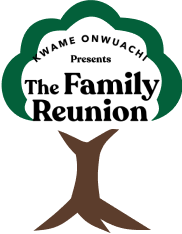
Current Logo

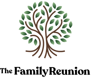
Redesigned Logo
CHALLENGE
Craft a visual identity that is recognizable, aligns with the brand’s mission, and can be used across multiple platforms. Use the newly developed visual identity to create new website for the brand.
DESIGN PROCESS

understand

inspiration

iterate

design
Understand
The first step in the process is to fully understanding where the brand is now and which direction it is heading. I took a look at the website, making annotations where I thought improvements could be made. Additionally, I crafted a brand strategy to have a something to anchor to as I made design decisions and prevent me from veering too far away from the original brand.
BRAND STRATEGY
I read every page of the current website, as well as articles mentioning the event and stories and videos showcasing the founder. Some aspects, such as the mission and values, were openly stated, while others needed to be inferred. Using that information I created the following brand strategy:
Brand Mission
The mission of The Family Reunion is to nurture, develop and celebrate racial and ethnic diversity within the next generation of hospitality professionals.
Brand Values
The Family Reunions gives back to the community, partnering with multiple Black-owned business to increase their visibility and donating a percentage of their profits to charity organizations and initiatives each year.
Brand Position
The Family Reunion is unique because it celebrates Black cooking traditions. Family style meals, cooking demonstrations, and panels delving into the detail about the history of food and Blackness make this food festival one of a kind.
Target Audience
Audience 1: Chefs and sommeliers looking to participate and/or learn from other hospitality professionals
Audience 2: People who love the food of the Black diaspora
Audience 2: People who love the food of the Black diaspora
Brand Tone
A fun, friendly, and inviting tone is used by The Family Reunion to create an atmosphere of inclusivity. Mimicking an actual family reunion, the brand creates uses warm and cheerful visuals and language to ensure everyone feels welcome.
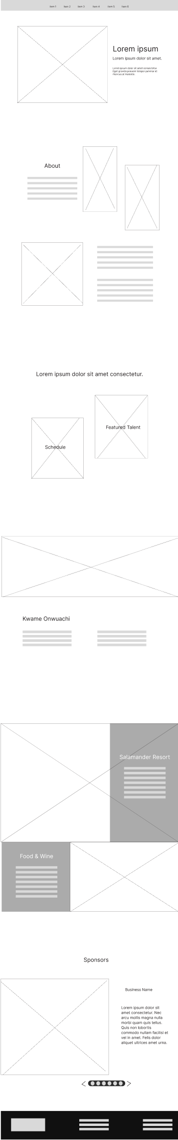
ORIGINAL WEBSITE
I visited the website and read each page in its entirety. I took a full page screen shot and mades notes on some aspects that might make it difficult for users to navigate the website or find information.
Inspiration
During this phase, I searched the internet for examples of what I would want to include in the brand’s visual identity.
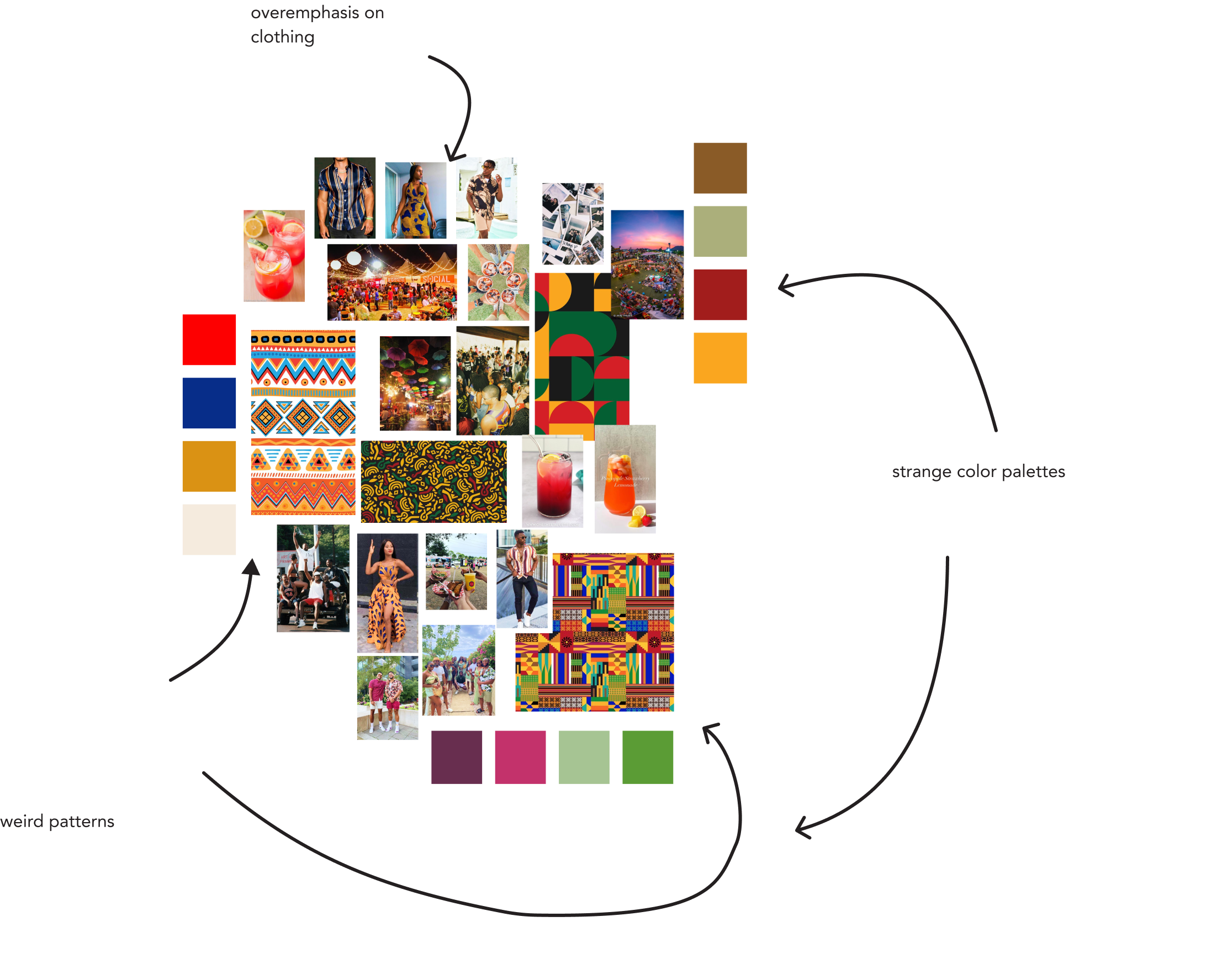
MOOD BOARD CHANGES
I created the first mood board and quickly felt that it did not align with the tone. This mood board lacked reference for typography, stylistic food imagery, and overemphasized clothing. These issues, combined with the very muted color palette, made it clear that this mood board had missed the mark. The second mood board mirrored the warm, inviting atmosphere presented by the brand. Images of food, fun patterns, and typography options sparked my creativity.
First Mood Board
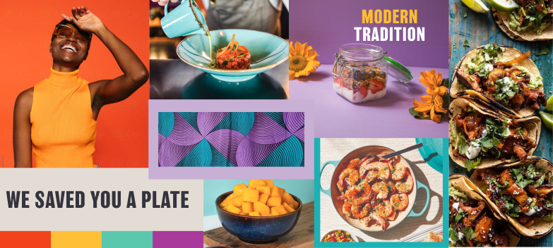
Final Mood Board
Iterate
These are the various logos, color palettes, and website wireframes that I designed before reaching the final design.
LOGOS
The logo was the hardest part of the visual identity to design and took the longest time. The original goal was to include a tree of some sort to symbolize a family tree. Instead, the logo looked like an environmental group or a lawn care service.


First Iterations of Logo
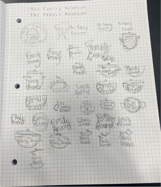
Logo Sketches


Second Iterations of Logo
TYPOGRAPHY, PATTERNS, and COLORS
The typography choices, patterns, and color palette below were shown to my classmates during a presentation. The feedback suggested the the colors did not mesh well together and the patterns were too busy. The decision to keep the same font from the original logo as the heading font did not match the new fun tone outlined in the brand strategy
First Iteration of Colors
Recoleta Bold
Headings
Poppins
Body Text
First Iteration of Typography
First Iteration of Patterns
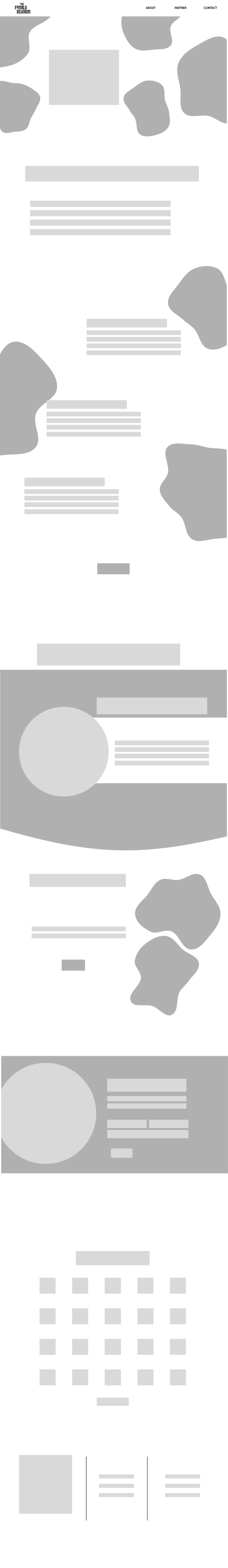
WEBSITE WIREFRAMES
The first iterations of the low fidelity wireframes were a bit too similar to the original website. This resulted in site layouts the mirrored luxury brands and did not bring that inviting and friendly tone outlined in the brand strategy..
Low Fi Wireframe 1
Low Fi Wireframe 2
Low Fi Wireframe 3
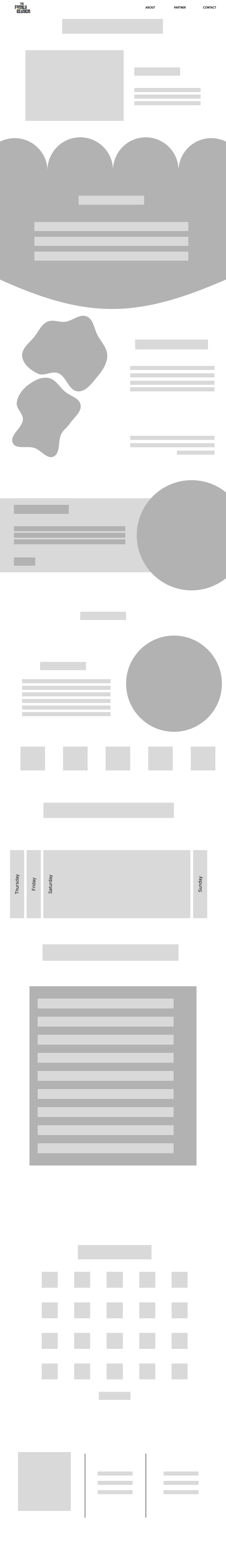
UPDATED WIREFRAMES
These newer low fidelity wireframes moved away from the minimalism of the first set and embrace a slightly chaotic energy, mimicking the feeling of a family reunion full of people catching up with loved ones that have not seen in a long time.
Low Fi Wireframe 4
Low Fi Wireframe 5
Design
Taking in the feedback from my instructor, classmates, friends, and family, I adjusted the colors and typography to better fit the brand. I included bright color patterns that evoked inclusivity and heritage, which are key features of the brand. After finalizing the visual identity, I created a home page and about page for a potential website.
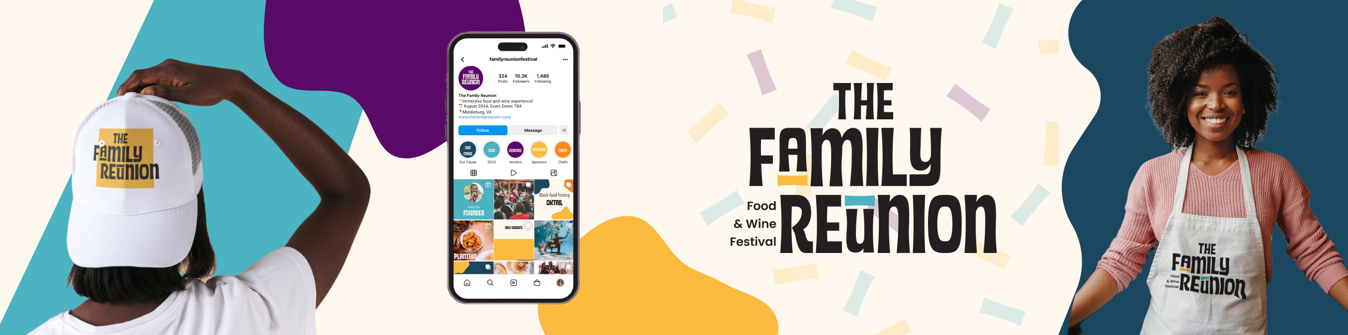
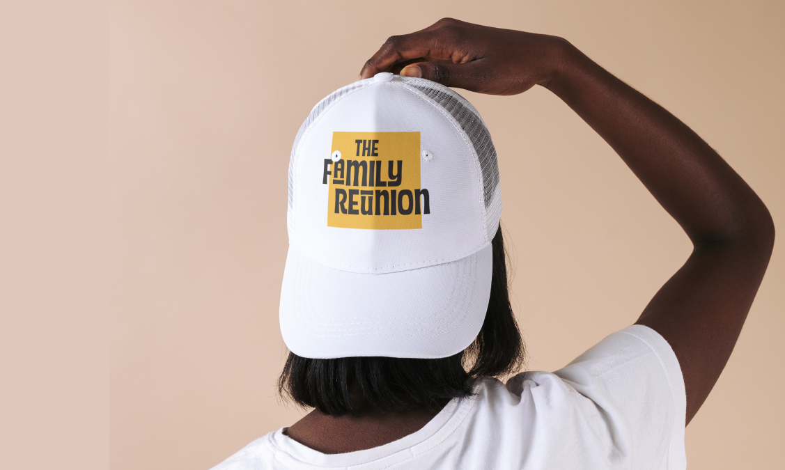
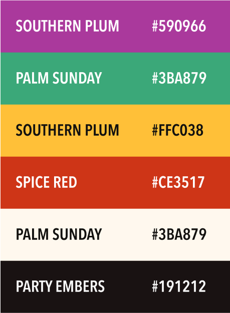
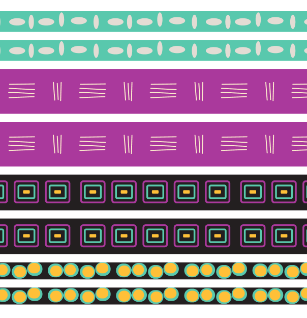
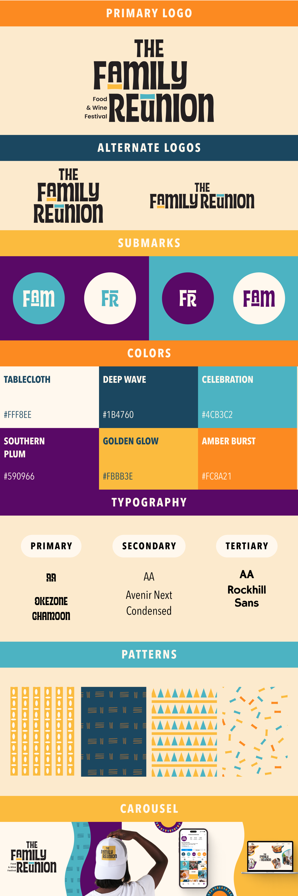
VISUAL IDENTITY
After much trial and error, I crafted a visual identity that fit the fun, warm, inviting tone outlined in the brand strategy. Various logos are including to allow for flexibility. Bright, high contrast colors and playful patterns inspired from clothing worn throughout the Black diaspora help emphasize the brand’s mission of developing and celebrating racial and ethnic diversity.
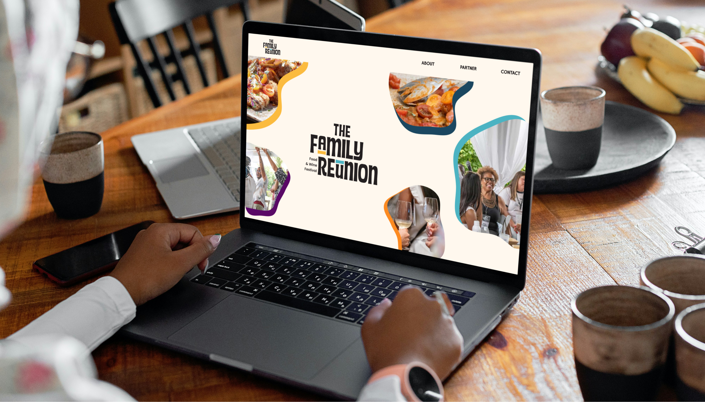
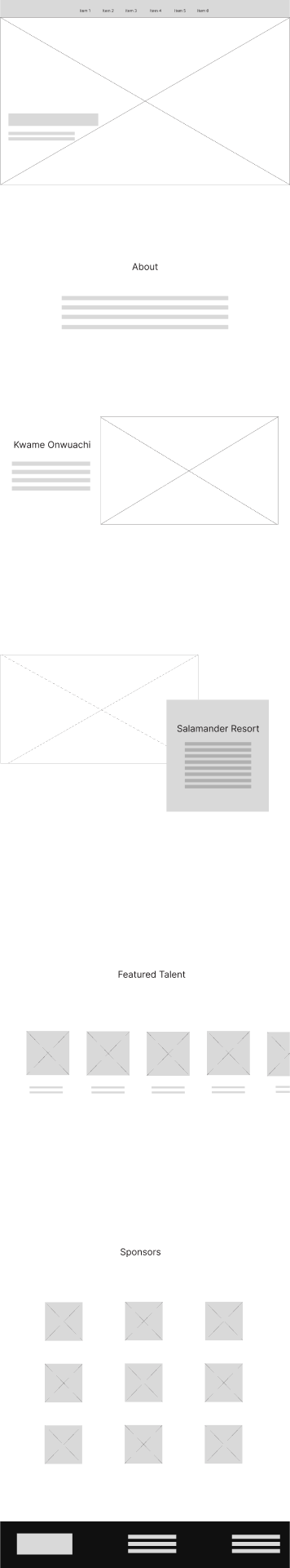
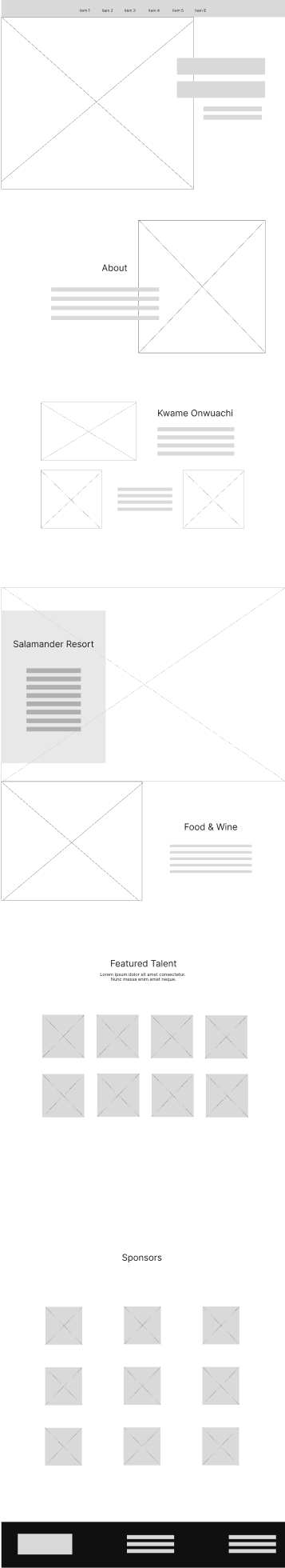
WEBSITE
With the visual identity completed it was time to create a website to see the designs in action. Adding a navigation allows users to quickly visit different web pages. In order to create the fun and slightly chaotic atmosphere felt at family reunions, an emphasis was put on abstract shapes, bright colors, and patterns. Color blocking was used to make it easier for users to identify different sections of the webpage.
High Fidelity Home Page
High Fidelity About Page
Reflections
This experience put me outside of my comfort zone and I loved every second of it. As a student pursuing my master’s degree in Human-Computer Interaction, the majority of my courses are focused on user experience and user research. It was nice to have the opportunity to focus solely on visual design.
- Visual design is not exactly the same as user experience design. For this specific project, most feedback that I received from people was based on feelings, not usability. This was new to me because I could not point to a specific data point to guide my design choices. For next steps I would love to user test the screens and interactions to see if the changes are usable.
- Critiques lead to better designs. I went out of my way to plan critique sessions with anyone who could spare the time. This gave me an abundance of feedback that helped me iterate and improve my designs.
- Project management is the key to success. I was juggling multiple projects during this time, which required me to manage my time, plan in advanced, effectively communicate with others. I easily could have been overwhelmed, but a strict calendar and Kanban board kept me organized.