Improving Filtering Functionality
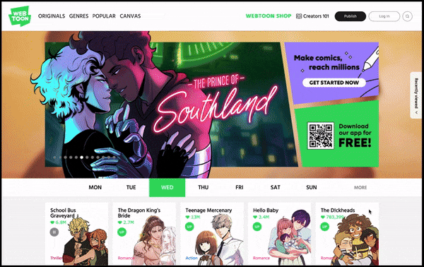
Webtoon is a South Korea based web comic hosting platform available on mobile and desktop. Originally launched in 2004 only in Korea, the platform is now available internationally. The company’s partnerships with brands like DeviantArt, CrunchyRoll and DC Entertainments has helped increase its brand awareness over the years.
During my first semester as a graduate student, I was tasked with completing a usability evaluation of a website of my choosing. Being an avid user of the platform, I chose Webtoon. In this case study I outline how I completed remote usability testing, analyzed the data, and used the data to make suggestions to improve the overall user experience.
DESIGN PROCESS
Understand
During this phase of the project, I conducted user research to understand how user currently navigate the platform, focusing on how users found comics, reached specific chapters, and utilized the ratings list.
USER TESTING
As a solo project, I was responsible for every aspect of user testing, including sourcing participants, creating user tasks, pilot testing, and data analysis. The results from this usability test allowed me to find opportunities to solve problems and improve the overall user experience. The main takeaways from the user testing were
🧐
Confusing Jargon
Language used throughout the website had very specific meanings that were not obvious to the users, creating confusion and friction when navigating the website
❔
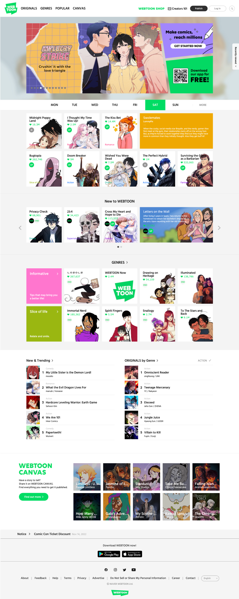
Locating Comics
Users were unable to discern the default sorting of comics on most webpages and struggled with finding specific comics. Some mentioned that multiple webpages housed the same information displayed differently, but could not understand the differences.
ℹ️
Finding Information
When seeking information, users found it difficult to navigate to pages that did not include comics. Finding information about the author, the company, or special programs was challenging.
Analyze
After taking a look at the data, I elected the focus on improving how users locate comics. The current platform offers limited filtering options and the default sorting confuses users. During the user testing, tasks that required users to locate specific comics took the most time to complete and had some of the lowest success rates. The primary question that I hoped to solve throughout this project is:
How might we decrease the time it takes to search for webcomics?
COMPETITIVE RESEARCH
I did a competitive analysis to understand how other webcomic hosting platforms organized their website and used search and filter options. This competitors included Mangatoon, Tapas, Toonmics, and Lezhin Comics. Many of the features
INSIGHTS FROM COMPETITIVE RESEARCH
1
Status
There is a clear distinction between comics that we ongoing, completed, or on hiatus.
2
Simplicity
Each platform has options for filtering and sorting immediately available on each webpage that displays comics
3️
Genre
The default sorting for most platforms is by genre.
Design
After a analyzing all results from the research, I was able to get an idea of what filtering and sorting could look like for the platform. I began brainstorming and sketching some initial ideas and then moved on to creating high fidelity prototypes.
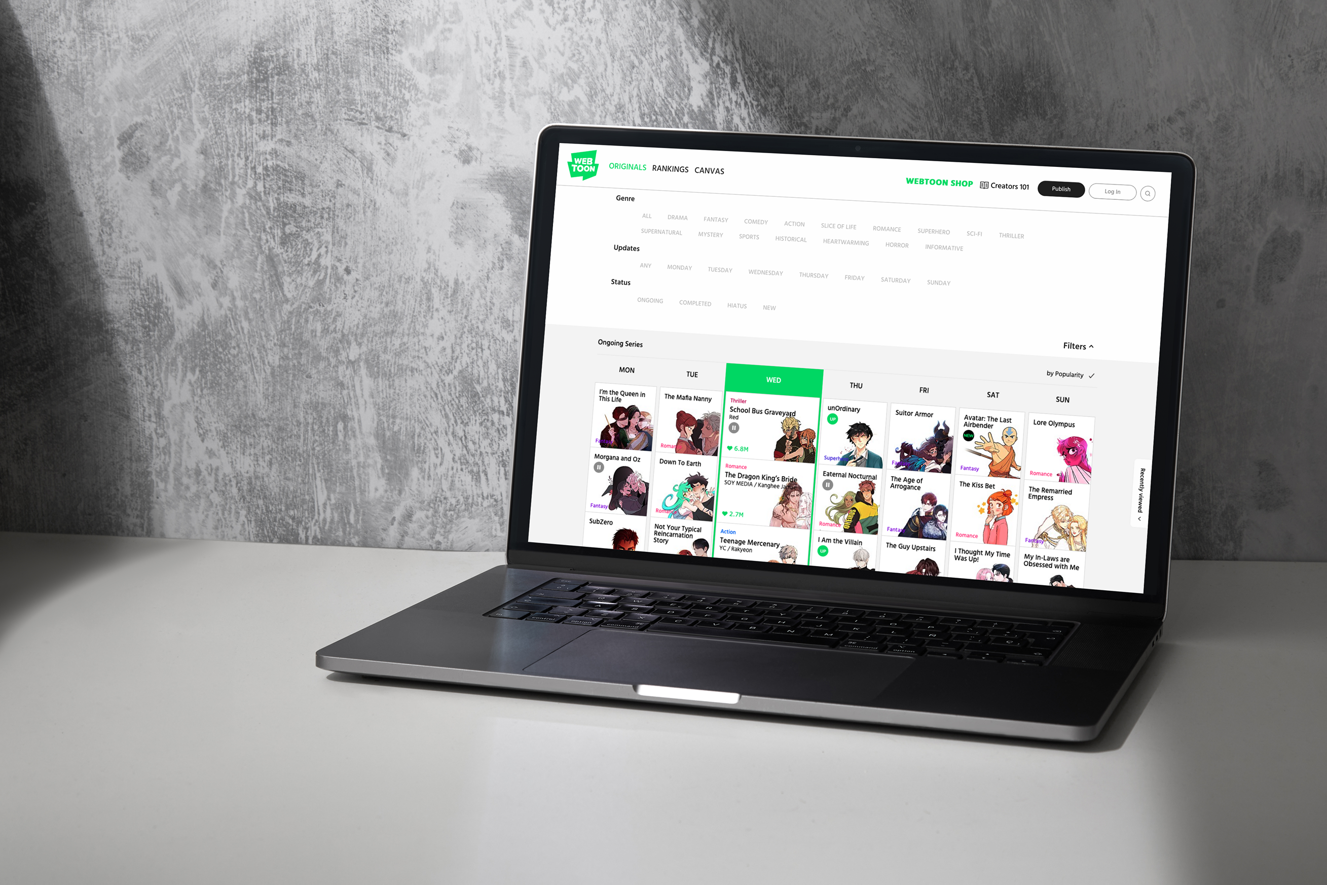
LOW FI SKETCHES
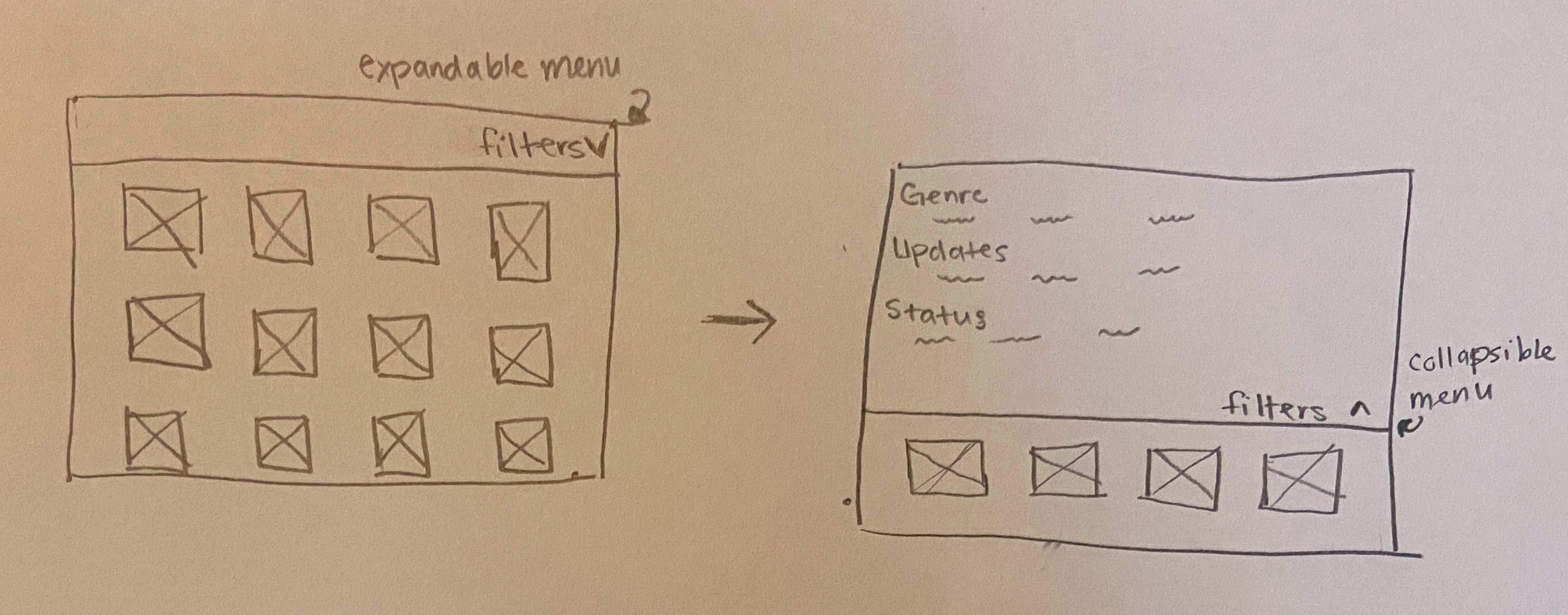
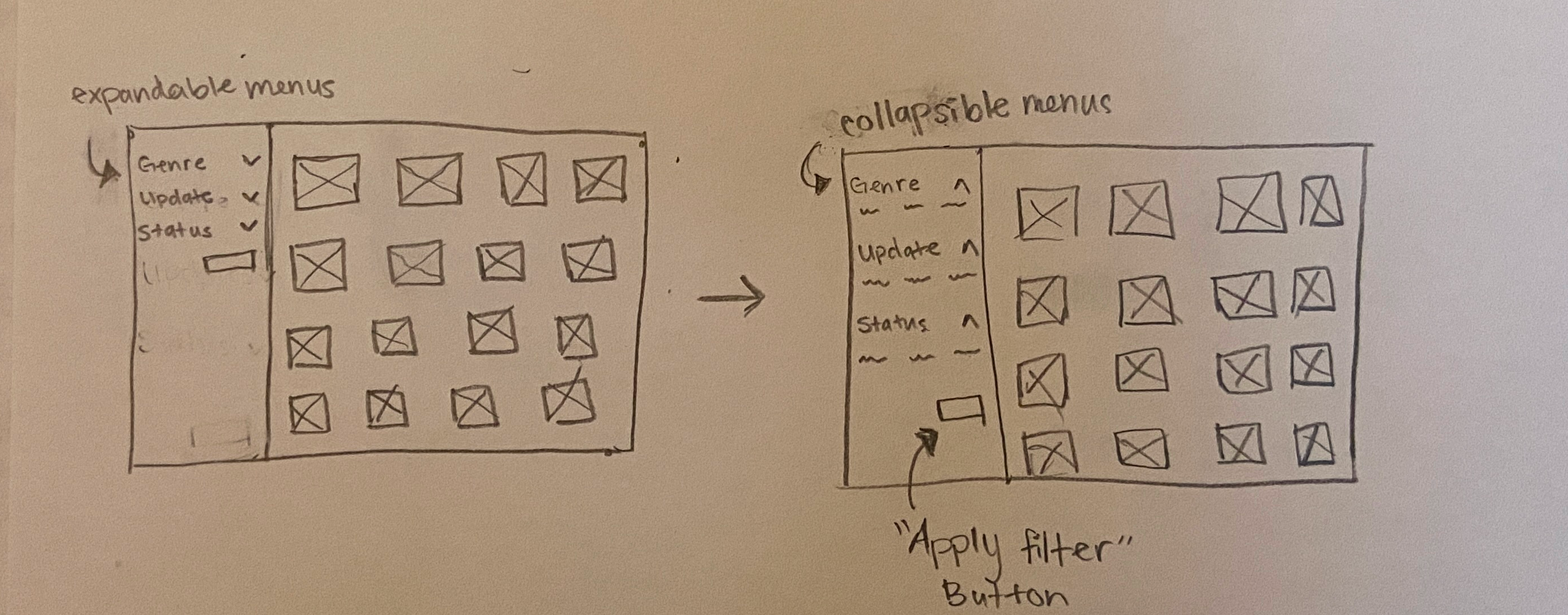
I toyed around with the idea of including a collapsible filter menu. I could not decide if I wanted to include it at the top of the page or attach it to the left side of the screen. Without additional data, I decided to build both.
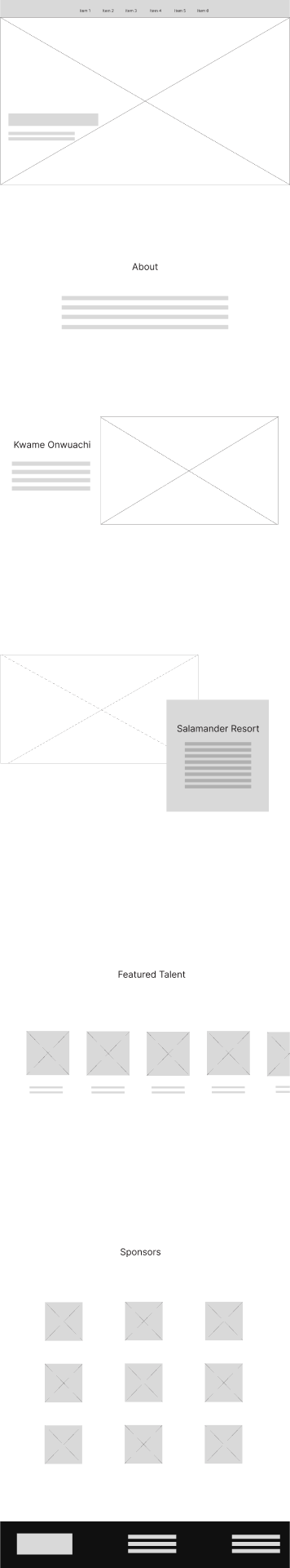
HIGH FIDELITY PROTOTYPES
The focus of this project was solely to improve functionality. As a result, I maintained the brand’s visual identity, using the same colors, typography, and overall visual tone. The only changes were the inclusion of a drop down or left side filter menu.
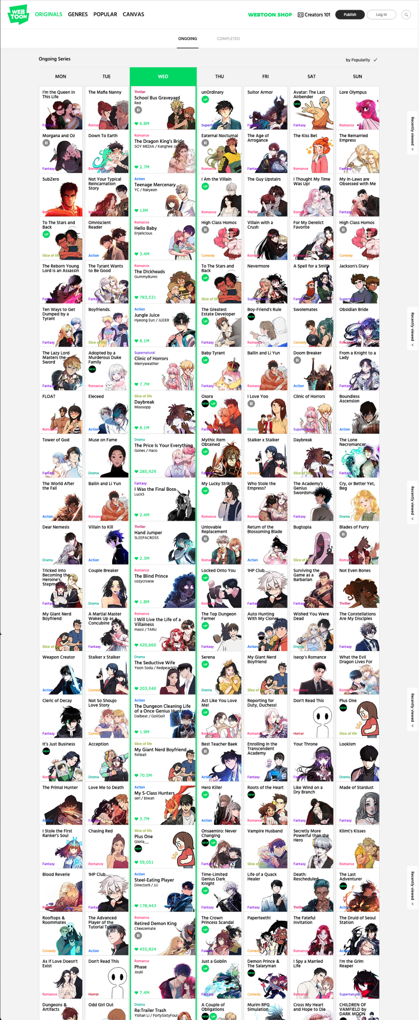
High Fidelity Prototype of Filter Feature 1

High Fidelity Prototype of Filter Feature 2
Reflections
This was one of my favorite projects. The opportunity to gain hands-on research experience is invaluable. As an individual assignment, it was great to have ownership of the entire project from start to finish. Some valuable lessoned that I learned includes
- Research backed design decisions are essential. Prior to completing the usability testing sessions, I already had ides about the changes I would make to the website. Had I not conducted this research, the design changes that I would have made would have been in direct contrast with what users want.
- Project managment skills kept me on track. During this time, I was working simultaneously on a separate team research project. Balancing both of them required strong communication, prioritization, and adaptability skills.
- Next Steps: I would love to have the opportunity to implement some additional user testing to validate the new feature and changes. During the testing phase, participants did not utilize the search option, so it is very possible that users would not use the filter options as well. Only data could prove if this changes solve the intended problem.